Pop Art Piece
|

|
Inspiration
|
Andy Warhol was an extremely successful consumer ad designer. He used the techniques of his trade to create an image that is both easily recognizable, but also visually stimulating.
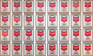
Andy Warhol was one of the most important artists of pop art, which became extremely popular in the second half of the twentieth century. Though he is best remembered for his paintings of Campbell's soup cans, he also created hundreds of other works including commercial advertisements.. |
What made these works significant was Warhol's co-opting of universally recognizable imagery, such as a Campbell's soup can, Mickey Mouse, or the face of Marilyn Monroe, and depicting it as a mass-produced item, but within a fine art context. In that sense, Warhol wasn't just emphasizing popular imagery, but rather providing commentary on how people have come to perceive these things in modern times: as commodities to be bought and sold, identifiable as such with one glance.
http://www.theartstory.org/movement-pop-art.htm, http://www.theartstory.org/artist-warhol-andy.htm, http://www.theartstory.org/movement-pop-art.htm
Planning
For this project in particular I wanted to work with vibrant, expressive colors. I fisrt worked with shadows and gradients of colors to show depth on a 2-dimensional image.

|
After having some experience using Hexel 2, the software that I used to create my digital self-portrait from my Summer Project, I want to use it agan on another piece. I experimented with different grids availible to me. I decided that I wanted a grid pattern the provided me with a uniformal shapes but also could add details to display shadowing and gradience.
I started by playing around with the program and seeing what I could do with it by manipulating aspects of color and visual colors. The pieces to the left represent experimentation on the program. ProcessWhen I was ready to start working on the actual project piece, I didn't necessarily have a stuctured way of creating it, but insead, similar to my experimentation, creating something in the flow of things. I knew that I want to create an isometric, 2-Dimentional design that would decieve the audience and see a 3-Dimentional image that would also image an illusion.
|
I used a method of Isometric projection to create the shape and form of the piece. Isometric projection is a method for visually representing three-dimensional objects in two dimensions in drawings. This was to kane the image be seem as different persepectives.
Along with color choice, I used colors that were appealing to the eye together. Also I used gradiences for the colors to illude the image to liike 3-Dimensional.
Along with color choice, I used colors that were appealing to the eye together. Also I used gradiences for the colors to illude the image to liike 3-Dimensional.
Meaning
In this piece I deliberately wanted to manipulate the audiences' sense of space, to create a sense of unreality, a particular setting for an idea or narrative, or simply to provoke us to see space differently. I idea for this piece was to show the different perspectives in life. People can look at the same thing, but take a diverse aspect of what is in front of them.
Connecting to the ACT
1) Based off of the inspiration I researched that influenced me to create my pop art piece made me practice and experiment different techniques to use to make the piece in order to get a general concept of what I had to work with for my piece, such as creating an illutive pattern technique on a 2-Dimensional surface.
2) I took a very open-concept and open to different kinda of patterns and colors when working on this project. I did this so that the piece wouldn't look as formal but instead something that I could take time and patience to create. I found that when implementing Pop Art-style art with my piece, I could use my inspiration as a way to better represent the meaning and style.
3) I discovered the value that pop art patterns and color has on people's perceptions and they way people see the world.
4) The conception of observation and 'putting to practice' was found to be very relevant for inspiration for me. The value of how my piece was presented was immensely important to reach to every aspect.
5) Concluding from my research, I discovered a deeper understanding of what my I used for my inspiration and was better able to produce a more meaningful and understandable art piece.
