|
|
Brainstorming
|
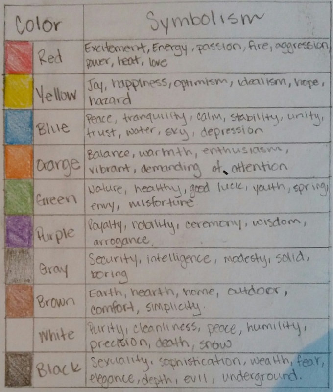
Color AspectsI created a color table to see what certain colors expressed and how I would be able to combine different colors in order to portray a specific feeling
|
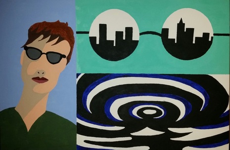
InspirationPop artists celebrated commonplace objects and people of everyday life, in this way seeking to elevate popular culture to the level of fine art.
The predominant colors used by Pop Art artists are yellow, red and blue. The colors used were vivid. In contrast to other art movements, pop art’s colors don’t reflect the artists’ inner sensation of the world. Instead, these colors refer to the popular culture and how they are presented. From this information I knew that I wanted to use bright, vibrant colors to match the color scale of Pop Art. |
|
|
|
|
