Title: M
|

|
|
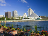
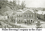
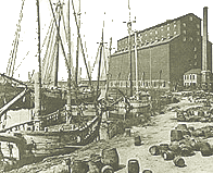
Culture Inspiration / History of MilwaukeeWisconsin's largest city lies on beautiful Lake Michigan, that arose from a collection of scattered settlements on a site familiar to the Native American tribes. Industry and business has attracted thousands of people from Eastern countries. Milwaukee became the primary destination of European immigrants from 1840 and into the 20th century. First to arrive in great numbers were the Irish, Germans and Scandinavians. They were then followed by Poles, Czechs and Italians. Milwaukee rose to early prominence as a trader of grain, and Milwaukee had been the largest shipper of wheat on the planet in the early 1860s. Shipping was joined by processing industries, flour, milling, meat-packing, leather-tanning, and brewing; that turned Wisconsin’s agricultural bounty into useful products. Later in the 1800s, manufacturing became the city’s lifeblood, and Milwaukee turned out an unmatched variety of steam engines, agricultural machinery, electrical equipment, mining shovels, and automobile frames.
The official flag of Milwaukee was adopted in 1955. It displays symbols of Milwaukee on a medium blue background. In the center, a gear, representing industry, bears symbols of Milwaukee's history: an Indian head representing Native American origins, and Milwaukee's Civil War flag. Below this is Milwaukee City Hall, representing government, which is flanked by a church, a factory, and the County Stadium. The golden barley stalk on the left represents Milwaukee's brewing history, and the red ship with water symbolizes Milwaukee's status as a port city. The Milwaukee flag has been criticized for being one of the worst flags because of being so "busy" and incorporating too many ideas into the flag.
|
Sources -
Engel, Jeff. "Milwaukee Named 7th Most Exciting City!." Fuel Milwaukee. N.p., 14 May 2013. Web. 16 Nov. 2015. <http://www.fuelmilwaukee.org/>. "HISTORY OF MILWAUKEE Continuing to Innovate for Over 85 Years." Milwaukee Tool. N.p., n.d. Web. 16 Nov. 2015. <https://www.milwaukeetool.com/company/milwaukee-story/history-of-milwaukee>. "Milwaukee Timeline." Milwaukee History. N.p., n.d. Web. 16 Nov. 2015. <http://www.milwaukeehistory.net/education/milwaukee-timeline/>. 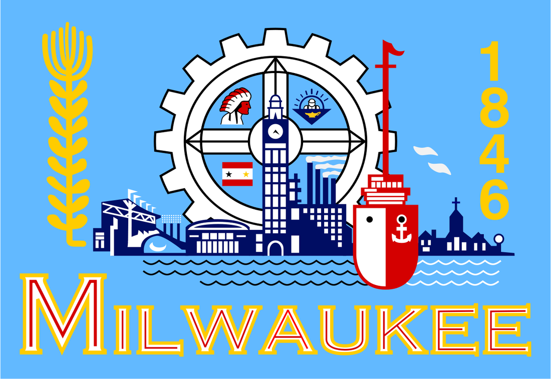
|
Process
|
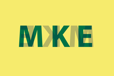
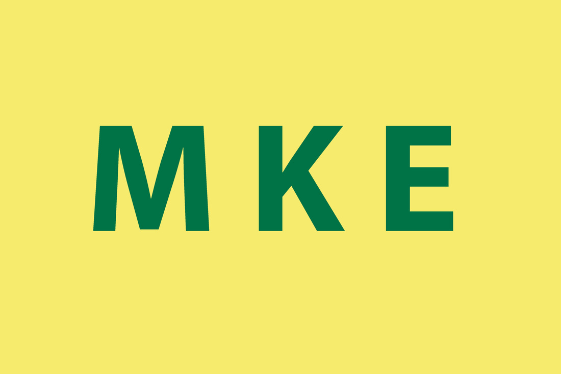
Originally, I had created multiple designs that I could use as a starting platform for my flag design. Initially, I was going to go with the design of the 'M K E' logo going across the middle of the flag, which clearly represented the Milwaukee Airport. When an adviser for MIAD came to check up on us and see what we had for ideas, he explained to me that my idea had a flaw. He said said that if the light were to be hitting the flag, you would see out the other side you would see 'M K E' backwards. He said I could purposely could do that. A logo at MIAD uses this technique for something MIAD incorporated in and that I should try doing that with mine. I thought that was a really good idea to do with my design seeing as it was so bland on its own. In Photoshop, I created a duplicate design of the 'M K E', and toned that color down as well as the transparency so that the overlapping effect would happen. I had that background a yellow-tan-golden color to represent Milwaukee's history on the brewing industry as well as that cream bricks that were made from clay in Milwaukee. These bricks were one of the most common building materials used in Milwaukee during the mid and late 19th century, giving the city the nickname "Cream City" and the bricks the name "Cream City bricks". Also, the overlapping 'Ks' in the middle looks like a very popular art piece in Milwaukee, known as 'The Calling" I-beams.Though, this is the only relationships I could make with this flag design and Milwaukee. So last minute, I just started playing around in Photoshop and ended up creating a figure that looked like an 'M'.
|
Back to the Drawing BoardFrom having my starting point of the 'M' figure, could do numerous things to the flag that would help represent Milwaukee. I looked at the main colors used in the original Milwaukee Flag as well as what colors were popular in the Milwaukee society like sport team colors and what specific colors symbolized. From these ideas and concepts I was ready of add a background to it.
|


Compare and Contrast

Multi-Colored Background
|

Single-Colored Background
|
I was questioned when I showed my art teacher the multi-colored background to him and he asked me "Why does it have to have different colors on the background? Why couldn't it just be one color?" I thought the best way to answer his question any any other question like his anyone else would have for me is to compare and contrast my flag design as it is, and if it were to just be one color for the background. Both do though have their strengths and weaknesses. To compare the two, they both have the 'M' figure in the middle of the flag, which represents many things towards Milwaukee. For instance, It was be interpreted as the letter 'M' for Milwaukee, it be looked at as the farm fields and the waves of Lake Michigan. It as well takes the form of the Mitchell Park Horticultural Conservatory (The Domes), also looking like the wings on the Milwaukee Art Museum and the opening roof at the Brewers Baseball Stadium. They both obtain the colors of a good land green, Emblematic of the deep woods and diverse landscapes of Milwaukee, and a cream, just as the Cream City brick is the foundation upon which Milwaukee was built, and the rich brewery history. Both flags are easy on the eyes and compliment each others colors.The flag on the right though, consists of a third color, a dark blue. Blue underlines the importance of the Great Lakes, Milwaukee being a port city, and the multiple rivers in the history and future of our city and state. In fact, some think the word Milwaukee was derived from the Algonquian term “Millioki,” which meant “gathering place by the waters.” The only problem with the Flag I choose is the same problem I had with my original flag designed where if the sun is the be hitting the flag, you will see a transparency of both colors through each side of the flag. In contrast, the single-colored background does not have to deal with this problem, but it look very bland and does not consist of many colors. I believe that both flags do a good job of representing what Milwaukee is, had done and what it can potentially become.
